Our Thoughts on Benjamin Moore’s 2026 Colour of the Year: “Silhouette”
A warm, grounded neutral designed for timeless interiors.

Every fall, designers, homeowners, and colour enthusiasts look forward to Benjamin Moore’s Colour of the Year announcement. It sets the tone for upcoming design trends and reveals what direction interiors are moving toward. This year’s selection, Silhouette AF-655, introduces a sophisticated warmth that feels both familiar and refreshingly current.
After several years of cooler neutrals dominating paint palettes, Silhouette brings depth, comfort, and subtle drama back into our spaces, adding richness without overwhelming a room.

Why Silhouette Stands Out
Silhouette is a unique neutral that bridges brown and charcoal, offering the versatility of black with a softer, more welcoming presence. It pairs effortlessly with a wide range of wood tones, metal finishes, and natural textures, making it easy to incorporate into existing homes.
It’s refined, timeless, and adaptable — suitable for both modern and traditional interiors.

Where It Works Best
Silhouette is particularly effective in rooms that benefit from depth and contrast. Consider incorporating it into:
• Built-ins and cabinetry
• Accent walls
• Dining rooms
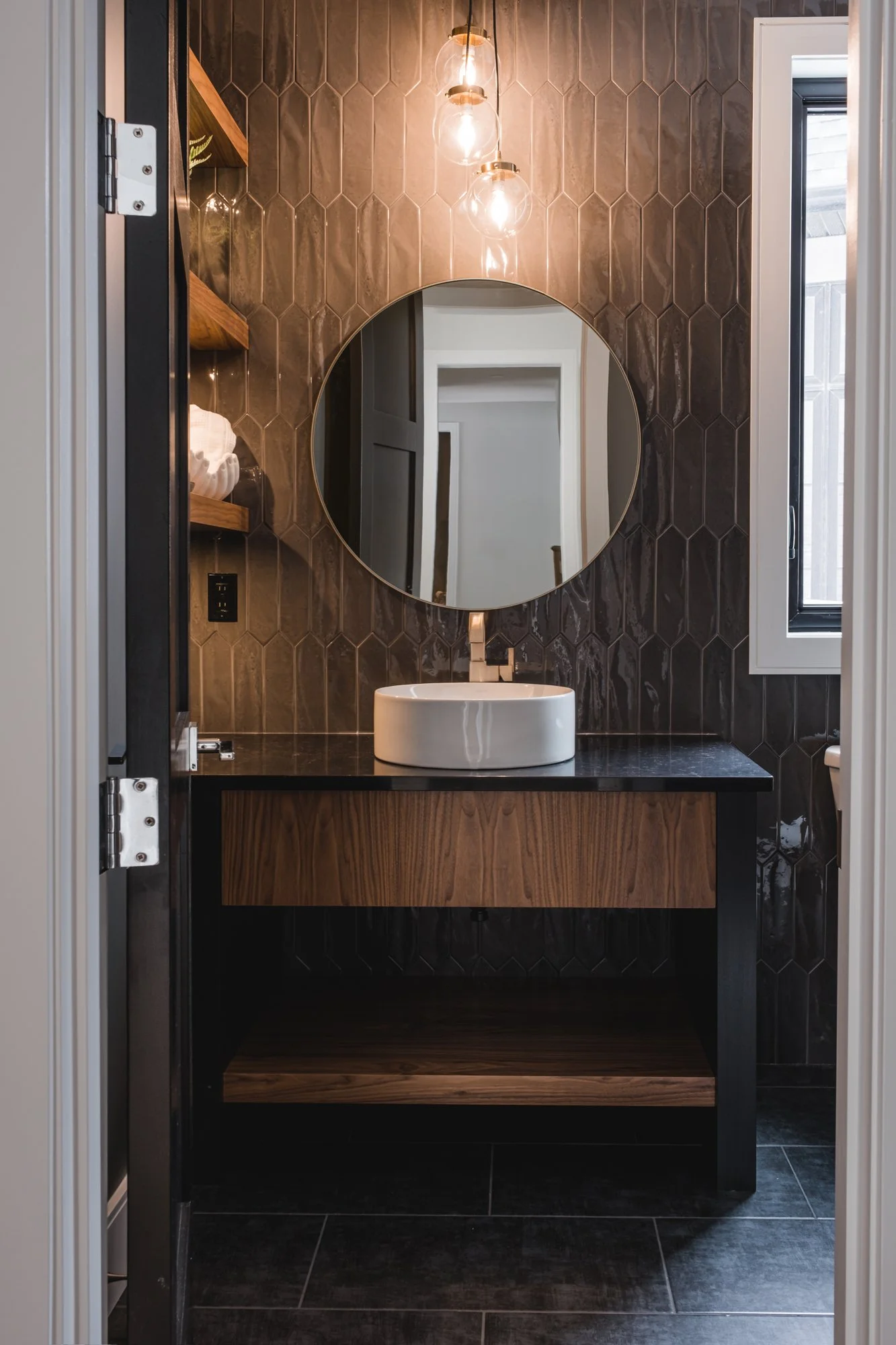
• Powder rooms
• Entryways
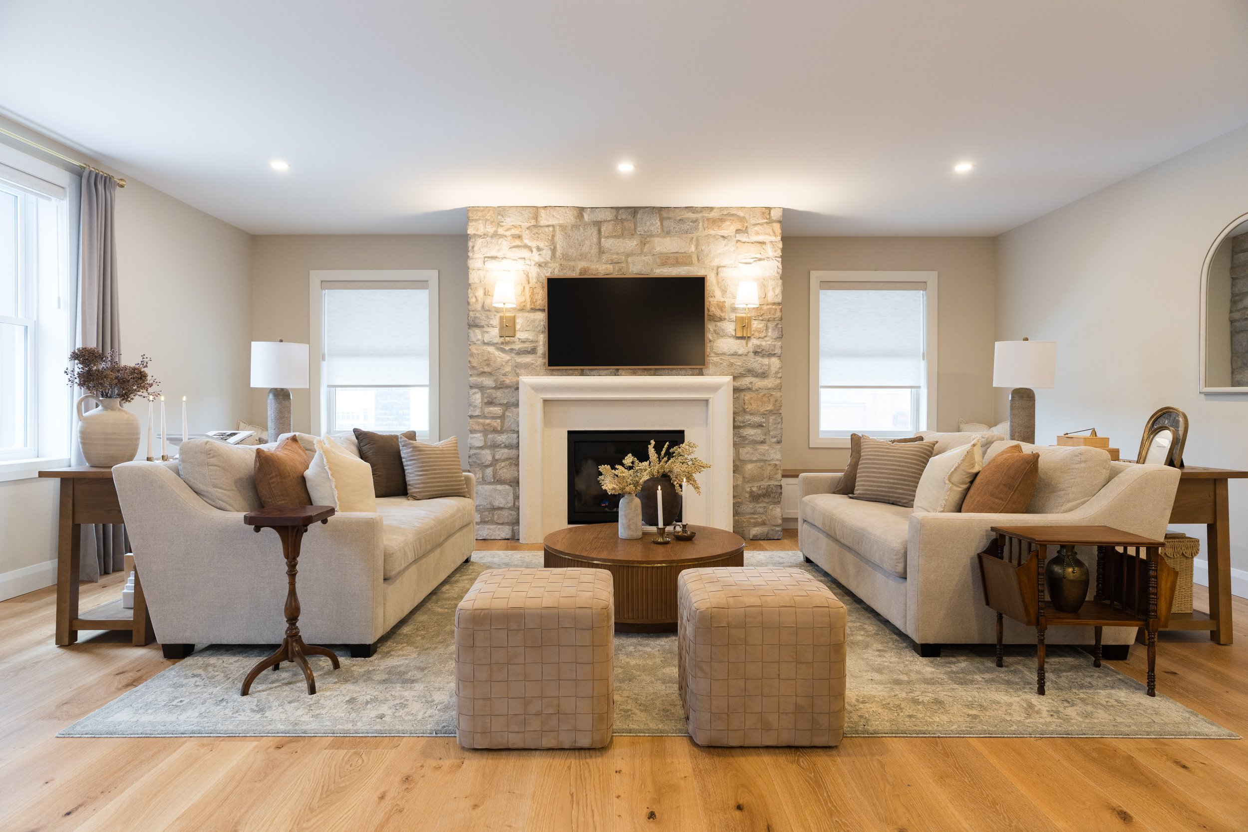
• Fireplaces
Professional tip:
This colour shines when paired with architectural detail, such as paneling, moulding, or millwork. Texture enhances its depth.

The Mood It Creates
Silhouette evokes a sense of:
• Warmth
• Intimacy
• Calm and comfort
• Sophistication
• “Quiet” luxury
It brings visual weight in a way that feels intentional rather than bold for the sake of being bold, and pairs naturally with warm textures and heritage materials.

The 2026 Colour Trends Palette
Silhouette is part of Benjamin Moore’s 2026 Colour Trends Palette, which includes eight curated tones ranging from grounding neutrals to uplifting accent colours; a balanced palette designed for layered, lived-in spaces. Together, these colours support the growing interest in warmth, natural materials, and timeless design.

Our Styling Suggestions
To enhance Silhouette’s depth, consider pairing it with:
• Warm woods (walnut, oak)
• Honed marble
• Brushed brass or bronze
• Linen and boucle upholstery
• Woven textures
For balance, incorporate soft lighting and tactile materials to create a cohesive, inviting atmosphere.

How we would incorporate Silhouette in a Design
We love the idea of creating a colour drench in a smaller room such as a Den, library or powder room. A colour drench is achieved by painting the walls, trim and ceiling with the same colour, in this case Silhouette. If that feels too bold of a commitment for you, consider adding Silhouette in smaller doses, such as some accent furniture pieces and decor.
Not sure where to start?
Consider the colours you naturally gravitate toward in your wardrobe.
They often translate beautifully into your home.
Our Perspective
We are loving this warm deeper tone. Silhouette offers a refreshing change from the white and grey tones that have dominated the design world over the past few years. It’s a colour that will remain relevant in five, ten, and even fifteen years — especially when paired with quality materials and thoughtful styling.
If you’ve been considering a warm, grounding neutral for your home, Silhouette is an excellent option. It provides character without overpowering your existing palette and adds a sense of refinement to any space it touches.
If you’d like assistance choosing the right paint colour or planning a room using Silhouette, the team here at Interiors By Sarah Langtry would be happy to help!